TREND PAINT COLOR AND HOME DECOR THEMES FOR 2019

Each year brings fresh, new color themes into our homes and lives through fashion, interior décor and accessories. Pantone is the color forecaster for the fashion and textile industry, while Sherwin Williams is the color guru for the Interior and Exterior Paint Color Industry creating new paint color palettes each year which represent the world around us.
If you follow social media trends through Instagram and Pinterest, then you will certainly see forecasted trend colors popping up. I love keeping up with trends and observing what colors are being shown as this gives me inspiration for paint color schemes for my clients.
Pantone Forecasted colors are often more bold than the paint palettes produced by Sherwin William Paints. Sherwin Williams paint palettes are often more muted than the forecasted Pantone Colors, though, they are in the same color family and have the same tones as the forecasted Pantone Colors, because most people prefer interior and exterior paint colors which are more muted and soft for everyday living in their homes and on their walls.
Pantone colors make wonderful accents in a home. They work splendidly with the Sherwin Williams paint palette colors to add pops of color in wall décor, home décor, and textiles. In addition, they can be used on the exterior of a home for front doors and exterior trim and as accent walls to create a dramatic backdrop for wall art.
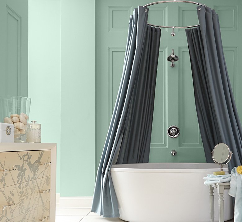
a calm oasis of relaxation created with paint in a bathroom:
Here is a paint color scheme created using Sherwin Williams Paint which creates a “spa” like feeling in a bathroom. Perfect for a bathroom with a bathtub as you can feel like you are floating on a sea of calm.
White and gray accents work perfectly with this color. Viewing the Color Palettes below the Sherwin Williams Paint Color Charming Pink could also be incorporated in towels, bathmats and textiles creating a “seashell” of a room… soft, soothing colors which you see when you go to the beach.
Or you could create a more vibrant, sunny and warm feeling by incorporating the Sherwin Williams Paint Color Friendly Yellow with your accessories.
If you want your bathroom to be more rich and intense in color than you can incorporate the Pantone Fashion Color Rose Quartz in your accents creating a more dramatic effect.
I often layer with colors when working with a client, using a monochromatic color scheme with colors in the same tone which adds depth and dimension to a room.
This shows how the trend colors forecasted by Pantone and Sherwin Williams can work together in order to create a complimentary color scheme.

